
O Almacén Cultural
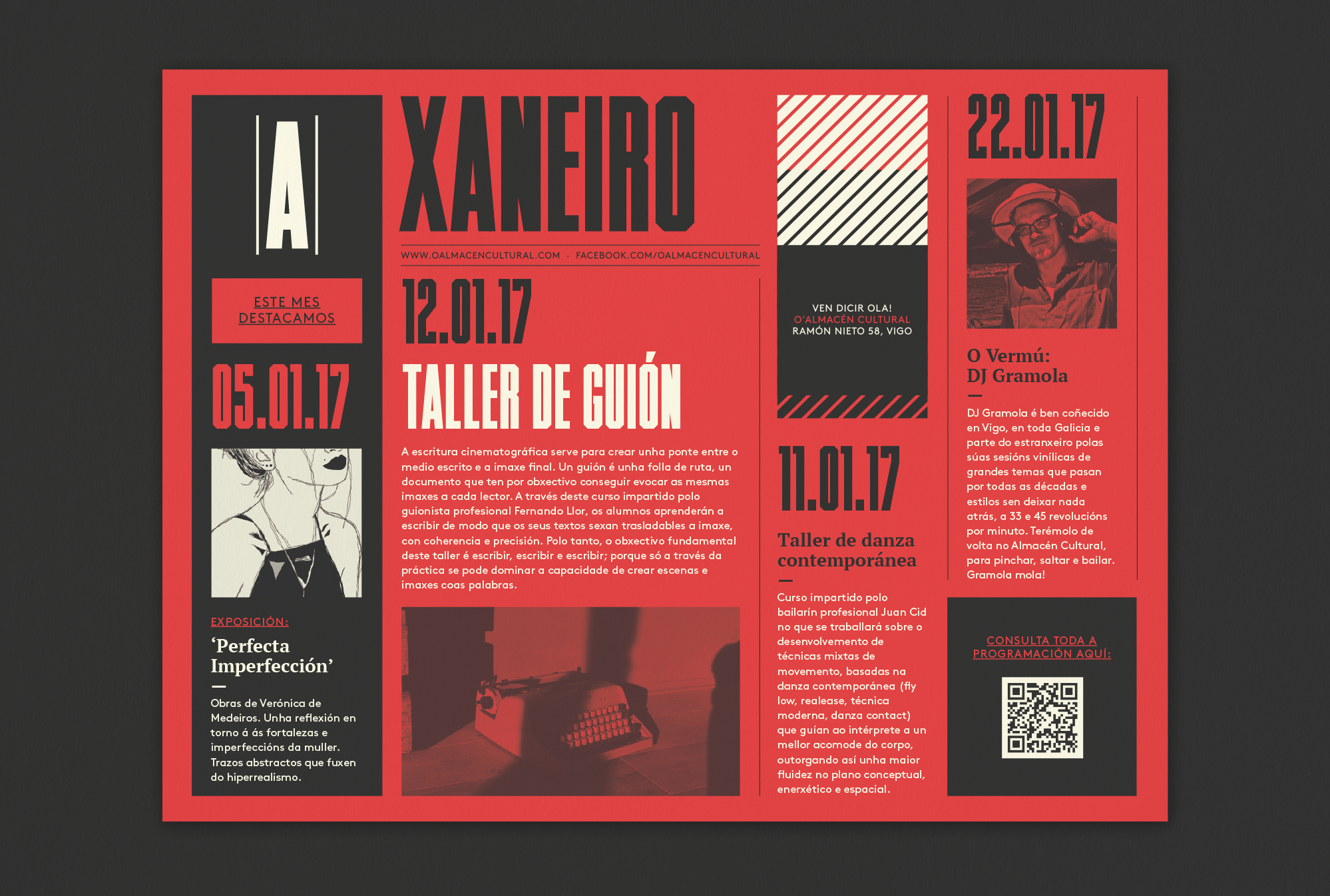
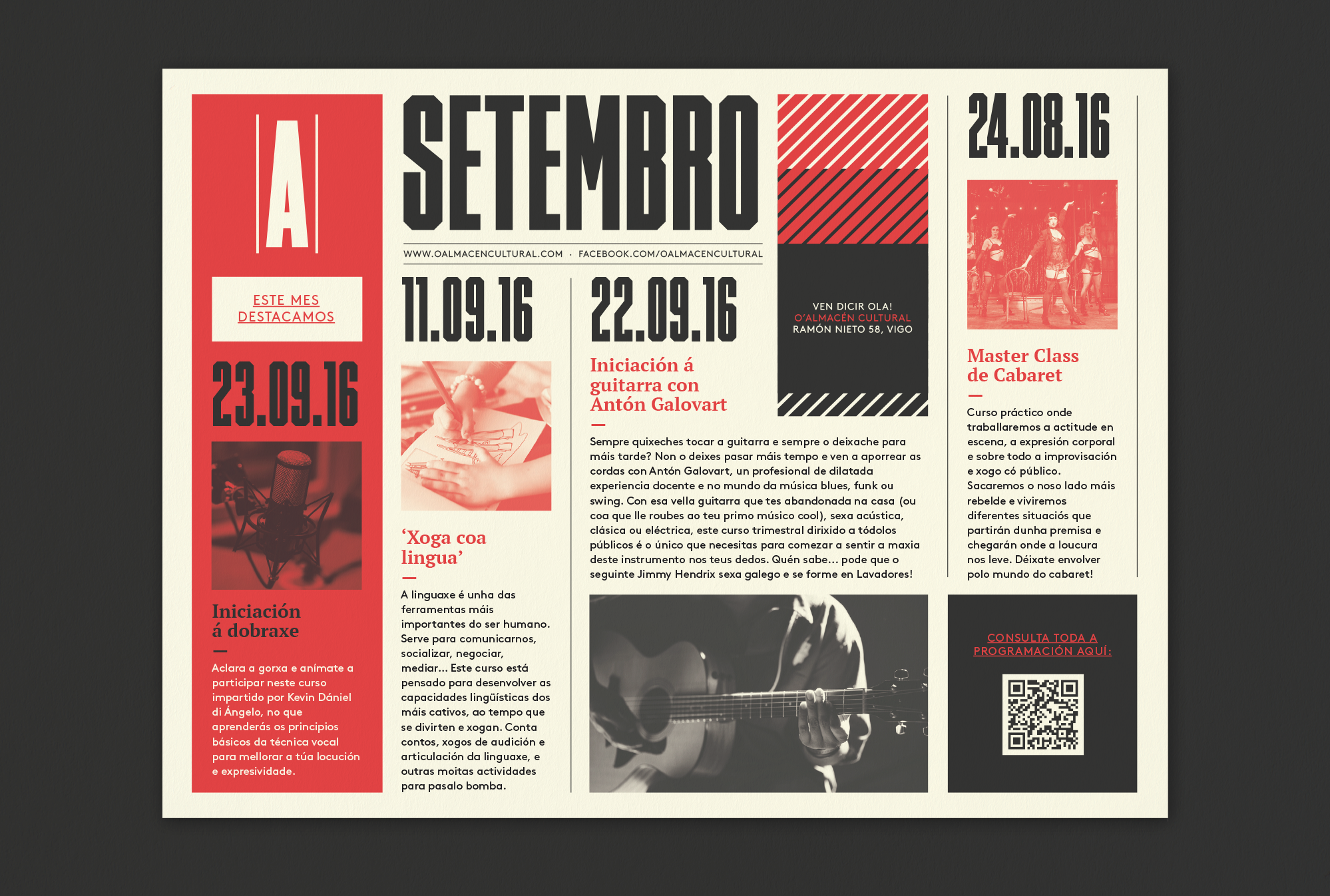
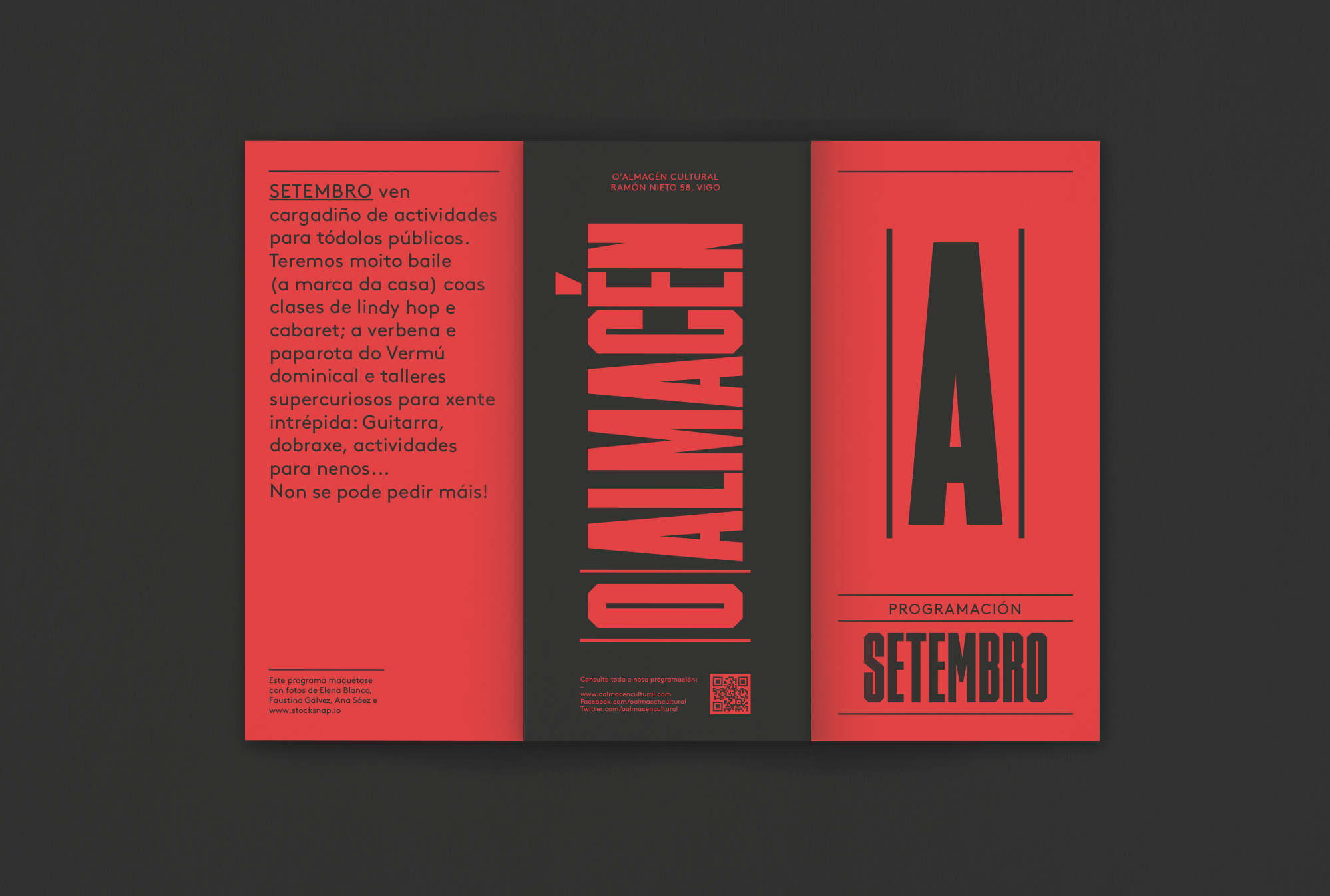
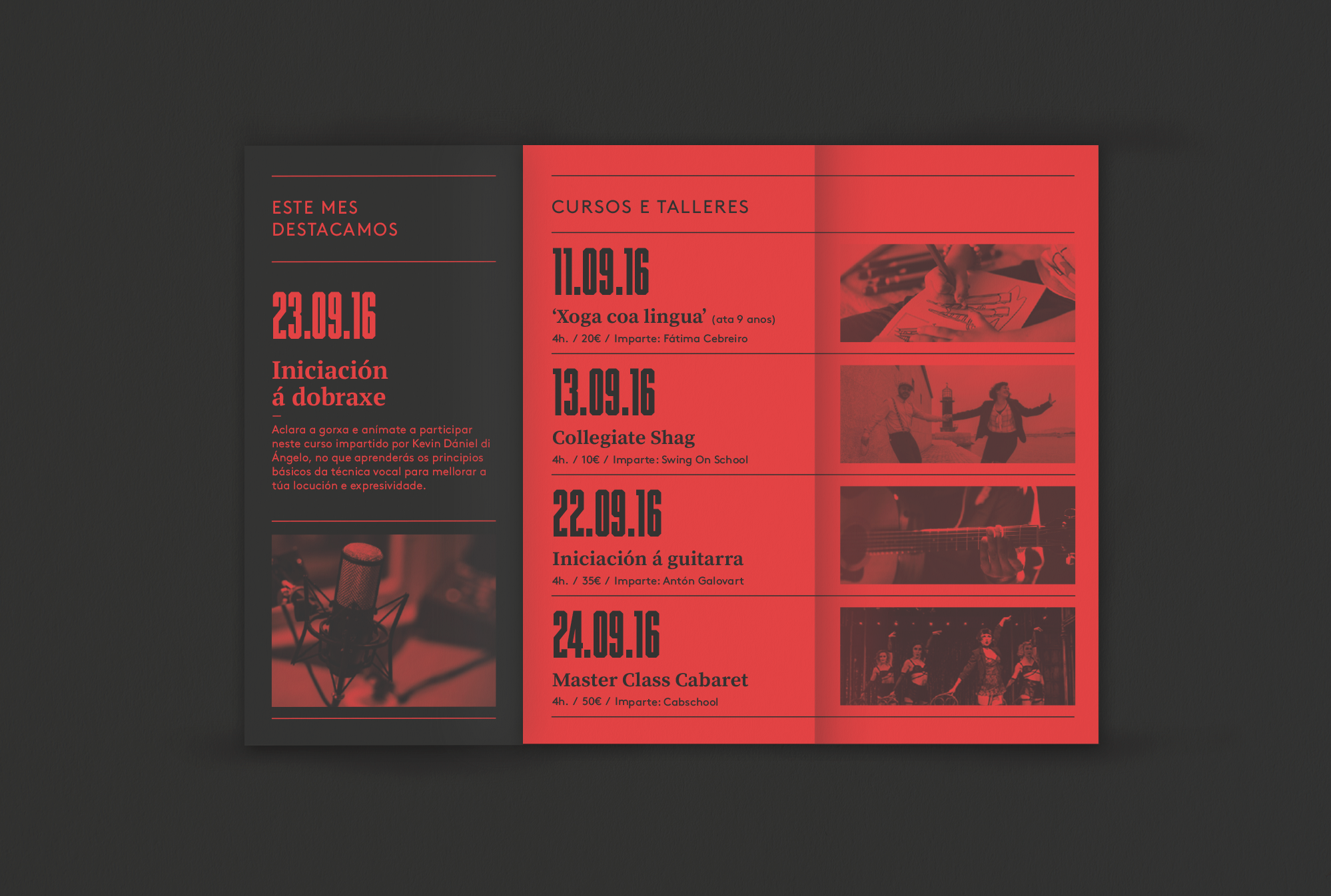
O’Almacén, 'The Warehouse’ in Galician, is a new cultural space and club in Vigo, Galicia (Spain). They offer a wide variety of activities for all ages, from a swing dance school, to a yoga master class. From a beer making course to a funk gig or an art exhibition.
O’Almacén owes its name to the location, a former fodder warehouse in a working class neighborhood, Lavadores, with a beautiful classical stone facade dated 1911.
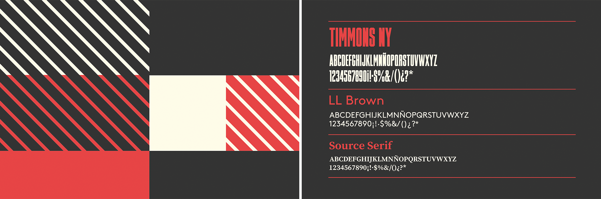
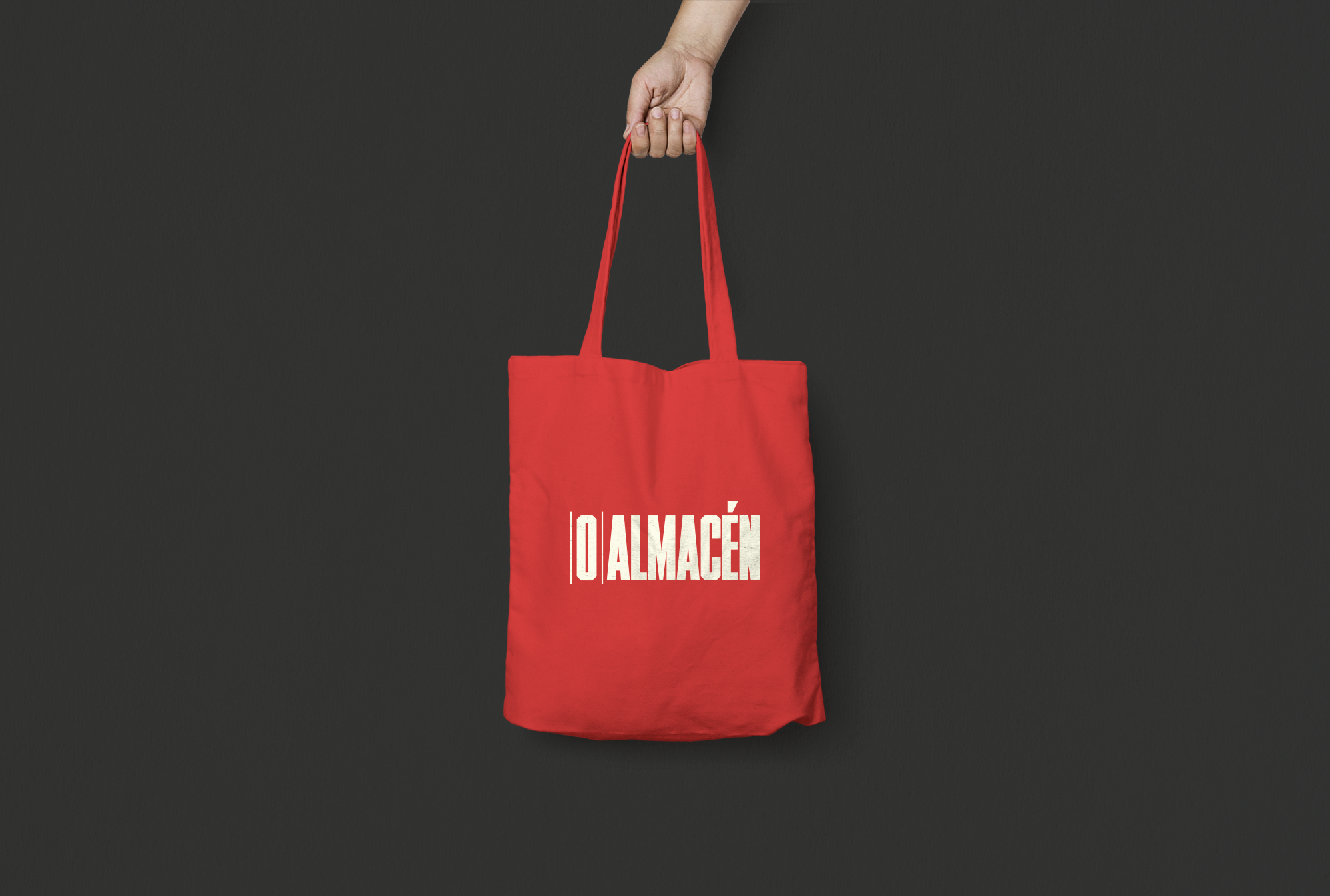
The identity and visual language was designed with the warehouse concept in mind. The type choice became a design tool with the beautiful Timmons NY, a muscular and tall headline font that helped create the illusion of a shelve rack that works great for the complete logo and the 'monogram’ version too. LL Brown and Source Serif Pro were used for other text needs, completing a nice and versatile type combination. The modular and mutant pattern was inspired by the boxes in the shelves. It worked as a great tool in almost every application.
The identity also needed to be expressive and bold in the use of colors. We chose a vivid red as the main corporate one, combined with a cream yellow and a dark grey, more related to the architectural space (interior and facade stone colors).